
TL;DR: Viral posts claimed Cracker Barrel’s CEO called the old logo “racist” and that the company “went woke.” Credible reporting and company materials show a different story: a modernization effort that included a simplified logo. The rollout messaging stumbled, but the company says legacy elements still appear in stores and it’s keeping the new mark.
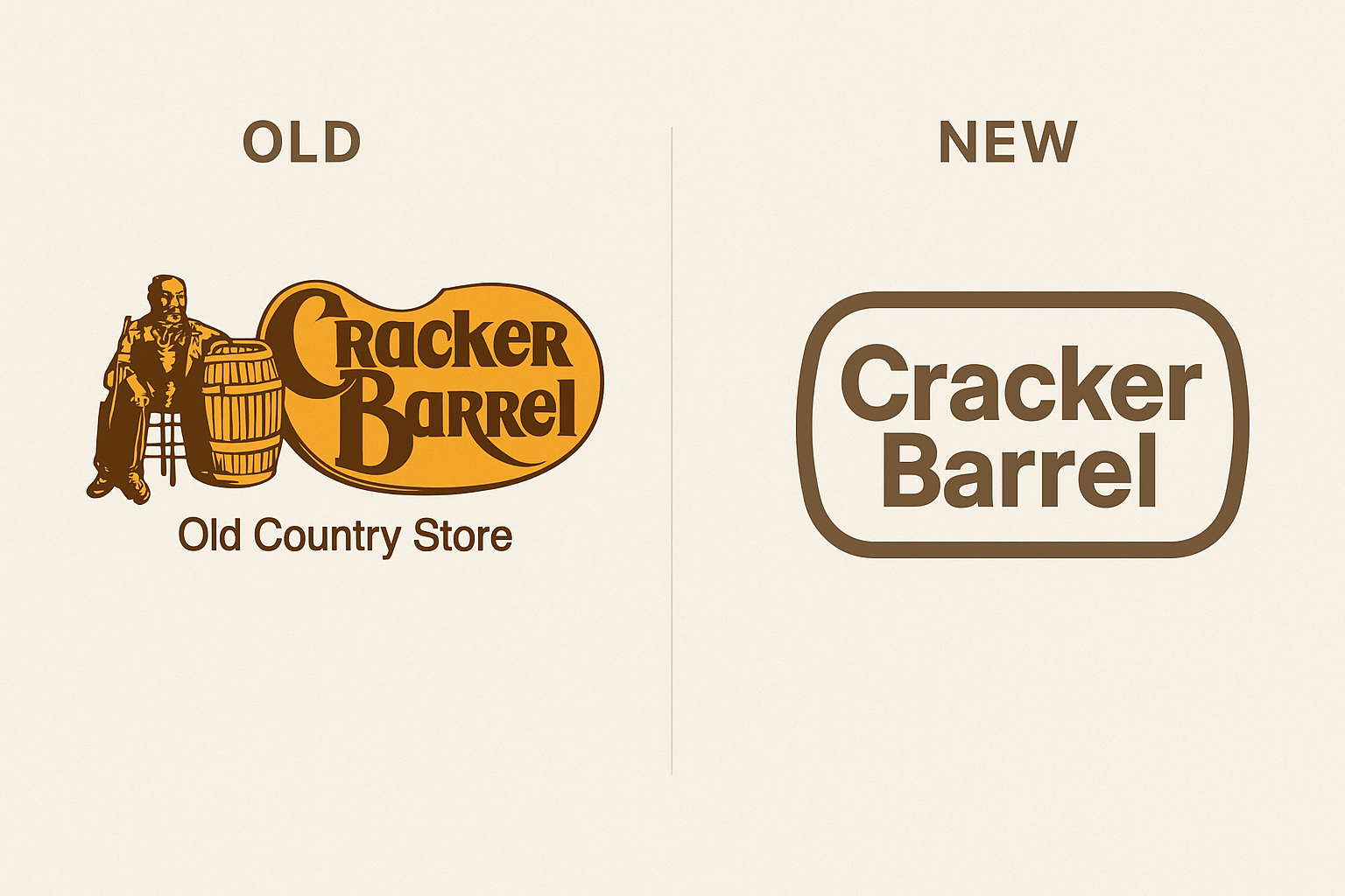
What Changed (and What Didn’t)
Cracker Barrel replaced its long-running logo (the man in overalls/“Uncle Herschel” and “Old Country Store”) with a cleaner, text-forward mark. The shift is one piece of a wider brand refresh—remodeled interiors, menu updates, and digital upgrades—not an ideological rebrand. Importantly, the company has noted that classic brand cues still show up on menus and in-store touchpoints.
Why the Logo Changed
The redesign sits within a multi-year strategic transformation plan focused on modernizing the guest experience and strengthening performance across channels (dining room, digital, and off-premise). Simplified logos are easier to scale across small screens, signage, packaging, and social media—part of a broader branding trend toward clarity and consistency.
What the Company Actually Said
After backlash, Cracker Barrel acknowledged it “could’ve done a better job” communicating the change and reiterated it is keeping the new logo. There is no credible reporting or primary document in which the CEO calls the old logo “racist.” That claim appears to be an unsupported social-media leap that got repeated without sourcing.
The Market Moment (Context Matters)
Shares fell sharply around the announcement window, with some headlines noting a brief ~$100M market-cap hit. Financial press also pointed to existing headwinds and broader market dynamics—i.e., it wasn’t just the logo driving investor sentiment. As usual, the viral narrative was simpler than the underlying business picture.
Where the “CEO said it’s racist” Rumor Came From
Classic “telephone game”: commentary reframed a routine brand simplification as a political move, then attributed motive to leadership without a verifiable source. Major outlets and the company’s own materials do not support the claim. If you see it again, ask for the primary link; absent that, treat it as unverified.
Quick Note on the “YTT Community” Reference
In this discourse, “YTT” means Yoga Teacher Training—a niche online crowd of yoga teachers/trainees who often discuss wellness and branding. It isn’t a formal organization; it’s a shorthand label for that subculture joining the conversation.
How to Spot (and Stop) This Kind of Misinformation
- Ask for sources: press releases, investor materials, or wire-service reporting. No link, no trust.
- Prefer primary and wire outlets: AP/Reuters and official company docs beat screenshots and hot takes.
- Separate rollout mistakes from motives: awkward communications ≠ ideological confession.
- Consider the full program: remodels, menu, and digital strategy frame why a logo evolves.
- Watch amplification loops: strong opinions and stock dips travel faster than corrections.
References
- Associated Press. “Cracker Barrel says it ‘could’ve done a better job’ with release of new logo…” (Aug. 25–26, 2025).
- Reuters. “Trump the latest to weigh in on Cracker Barrel logo dustup.” (Aug. 26, 2025).
- The Washington Post. “Critics deride Cracker Barrel’s new logo as ‘sterile,’ ‘soulless’ and ‘woke.’” (Aug. 21, 2025).
- The Washington Post (Food). “Cracker Barrel is trying to modernize. Bless its heart.” (Aug. 26, 2025).
- Barron’s. “Why Cracker Barrel’s Stock Drop Wasn’t a ‘Buy the Dip’ Moment.” (Aug. 26, 2025).
- CBS News. “Cracker Barrel loses almost $100 million in value as stock plunges after new logo.” (Aug. 21–22, 2025).
- Cracker Barrel Investor Relations. “Update on Strategic Transformation Plan.” (May 16, 2024).
FAQ
Did the CEO call the old logo ‘racist’? No. There’s no credible source for that claim.
Is the company keeping the new logo? Yes—while also keeping traditional visual elements elsewhere in the experience.
Is this just “blanding”? In part, yes: simplified marks perform better across modern touchpoints.